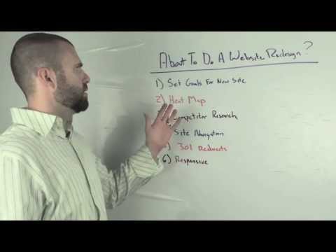
Too many companies chase a website redesign without a plan. How frustrating is it to spend thousands of dollars and make no forward progress with your web presence? If you know what I'm talking about, you need a plan. Check out our list of 6 things you need to think about when redesigning your website.

1. Set Goals for the New Site
Define your goal, is it more traffic, better conversions, more links? It sounds simple but write them down so that you can stay focused and not entertain rabbit trails. Everyone has an idea of how they would like the site to look and function and as you start the process of designing and developing, you will see other sites you like and want to start integrating those new ideas into your layout. The problem here is that it's easy to get away from your goals and you end up with a Frankenstein website that is no more useful than your old website.
2. Utilize Heat Maps to Define What Works and What Doesn't
You can place a piece of code on your website that will track user interaction. Heat Maps visually show you where people click and how they navigate your website. They may be missing something you really want them to see. This will help you see how your users see your website.

Note: Don't forget to put a heat map on your new site so that you can measure if your changes are performing how you expect.
3. Do Some Competitor Research
See what your competitors are doing and what they are up to. Don't copy them but see if there's anything worthwhile that they may be doing that you aren't. Make a spreadsheet of each competitor and then make lists of what you like about each. Do this before you start desgining so that you aren't trying to squeeze something in and instead the design can be created as a whole, with your input and ideas already integrated.
Note: Make sure you don't have conflicting feedback. i.e. If you like the white space on one site but then the dense content on another, you may not be able to have them both. Go back to your goals to decide which route is best for you.
4. Define Your Site Navigation Before You Start Designing
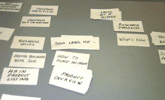
Structure your website navigation and structure ahead of time. Create a spreadsheet or a mind map to determine what pages should be where and then you can go backwards to create categories. One fun way to do this is to use index cards to create your categories and pages and then lay them out as you want them on the website. Share the cards with others and have them lay the cards out based on how their minds work, you'll learn how others think.

5. Create 301 Redirects to Communicate with Google, Yahoo, and Bing
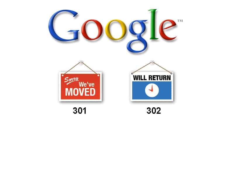
For SEO purposes, make sure you create a 301 redirect to tell the Search Engines that the page moved. If someone is linking to a page and you move it, you don't want users or Search Engines to see a 404 Not Found error. Also make sure that no page is deleted, it should be accounted for with a redirect to a page that is relevant to the old page.
A 302 redirect is a temporary redirect and is only to be used in specific cases, such as redirecting www.google.com/en-US/ to www.google.com. In the majority of cases, you want to use a 301 redirect.

6. You Have to Think About Your Mobile Users - It's no longer an option.
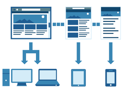
A responsive design allows the web page to change form based on the device it is being viewed on. This is one of the easy ways to make sure your content is available on all devices and maintain your branding. Such a large portion of the web is mobile, we think that by the end of 2013 every website firm should be building responsive.

